CSS3动画探秘:Canvas 实现也是可以的,这里不做介绍,本次主题是 css3 动画
CSS3实现
Demo
来自 dribbble 某位大师的作品
方式一:切换图片
1
2
3
4
5
6
7
8
9
10
| @-webkit-keyframes GIF{
0% {background-image: url(GIF_1.png);}
14.3% {background-image: url(GIF_2.png);}
28.6% {background-image: url(GIF_3.png);}
42.9% {background-image: url(GIF_4.png);}
57.2% {background-image: url(GIF_5.png);}
71.5% {background-image: url(GIF_6.png);}
85.8% {background-image: url(GIF_7.png);}
100% {background-image: url(GIF_1.png);}
}
|
方式二:切换背景图片位置
1
2
3
4
5
6
7
8
9
10
| @-webkit-keyframes GIF{
0% {background-position: 0 0;}
14.3% {background-position: -180px 0;}
28.6% {background-position: -360px 0;}
42.9% {background-position: -540px 0;}
57.2% {background-position: -720px 0;}
71.5% {background-position: -900px 0;}
85.8% {background-position: -1080px 0;}
100% {background-position: 0 0;}
}
|
方法分析:
方式一:实现起来会比较简单,但带来额外的请求数,图片体积较大
方式二:需要设计雪碧图,并量取背景位置,请求数少,压缩图片体积
CSS3动画帧数计算器
1
2
3
4
5
6
7
8
9
10
11
12
13
14
15
16
17
18
19
20
21
22
23
24
25
26
27
28
29
30
31
32
33
34
35
36
37
38
39
40
41
42
43
44
45
46
47
48
49
50
| 案例分析:单向循环
利用这个step阶梯函数我们可以做出像一开始我们做出的逐帧动画的效果
雪碧图内图标个数:23==帧数
则动作个数:24
由于是人物动作,所以要没有停顿效果
动作个数:24
动作过渡帧数:4.3
animation: anim-name 1s linear infinite;
动画标准是一秒24帧
@-webkit-keyframes anim-name{
0%{ }
4.3%{ }
8.6%{ }
12.9%{ }
17.2%{ }
21.5%{ }
25.8%{ }
30.1%{ }
34.4%{ }
38.7%{ }
43%{ }
47.3%{ }
51.6%{ }
55.9%{ }
60.2%{ }
64.5%{ }
68.8%{ }
73.1%{ }
77.4%{ }
81.7%{ }
86%{ }
90.3%{ }
94.6%{ }
100%{ }
}
.GIF{
width: 800px;
height: 600px;
margin: auto;
background: url(../img/charector.png) 0 0 no-repeat;
animation: GIF 1s step-start infinite;
-webkit-animation: GIF 1s step-start infinite;
}
|
1
2
3
4
5
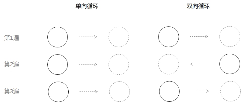
| 用CSS代码的方式表示,就是:
单向循环: animation-iteration-count: infinite; animation-direction: normal;
双向循环: animation-iteration-count: infinite; animation-direction: alternate;
|
雪碧图合成
HTML5在线雪碧图片合成工具
使用Compass生成雪碧图
SmartSprites 智能批量合并 CSS 雪碧图
ispriter
csssprites
animation
动画
H5动效的常见制作手法
css3-animation
多屏CSS动画精进技巧